


In this article, we will discuss about layouts in jetpack compose with examples.
What is Layout in Android?
The fundamental units that make up the user interface are layouts. It offers a transparent holding area for the views or layouts. A collection of views or layouts can be inserted inside of layouts. Layouts like rows and columns help us arrange our views in a linear fashion.
RelativeLayout, LinearLayout, FrameLayout, ConstraintLayout, and other layout types are used in traditional Android programming. Similarly, Jetpack Compose currently provides a variety of layout types:
- Row
- Column
- Box
- Constraint Layout
- Scaffold
Let's first learn about the modifiers before moving on to the layouts.
Modifier
Modifiers allow you to change specific features of the component that determine how the layout is shown on the screen. It allows altering an element's size, appearance, and usability as well as its scrolling, moving, clicking, and zooming capabilities.
// Example: height = 100.dp, width = 100.dp
Box(
    modifier = Modifier
        .height(100.dp)
        .width(100.dp)
        .background(Color(Colors.Red))
) {

}
You can read more about modifiers here.
Row
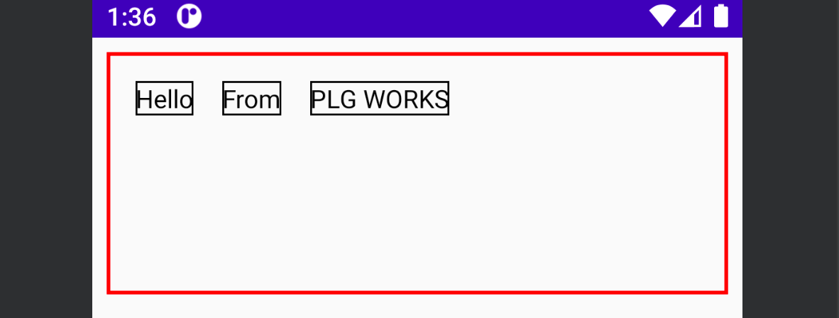
Row layout places the elements horizontally on the screen. It is almost similar to the Linear layout with a horizontal orientation. It is a composable function with four arguments - modifier, horizontalArrangement, verticalAlignment and content.
@Composable
inline fun Row(
    modifier: Modifier = Modifier,
    horizontalArrangement: Arrangement.Horizontal = Arrangement.Start,
    verticalAlignment: Alignment.Vertical = Alignment.Top,
    content: @Composable RowScope.() -> Unit
)
horizontalArrangement - It is used for the alignment of the children. we can provide the following arrangements - start, center, top , space-evenly, space around etc.
verticalAlignment - It is used to specify the vertical alignment of the children. It has three values - top, verticallyCenter and bottom.
We can change the alignment using verticalAlignment and horizontalArrangement as per the requirements.
Example:
   @Composable
    fun DisplayRowLayout() {
        Row(
            Modifier
                .fillMaxWidth()
                .height(150.dp)
                .padding(8.dp)
                .border(2.dp, Color.Red)
                .padding(8.dp)
        ) {
            Text(
                text = "Hello",
                Modifier
                    .padding(8.dp)
                    .border(1.dp, Color.Black)
            )
            Text(
                text = "From",
                Modifier
                    .padding(8.dp)
                    .border(1.dp, Color.Black)
            )
            Text(
                text = "True Sparrow",
                Modifier
                    .padding(8.dp)
                    .border(1.dp, Color.Black)
            )
        }
    }
Column
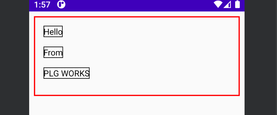
Column layout is used to display the elements vertically on the screen. It is similar to the Linear layout with a vertical orientation. It is a composable function with four arguments - modifier, verticalArrangement, horizontalAlignment and content.
@Composable
inline fun Column(
    modifier: Modifier = Modifier,
    verticalArrangement: Arrangement.Vertical = Arrangement.Top,
    horizontalAlignment: Alignment.Horizontal = Alignment.Start,
    content: @Composable ColumnScope.() -> Unit
)
view rawverticalArrangement: It is used to provide vertical alignment to its children. we can provide the following arrangements - start, center, top , space-evenly, space around etc.
horizontalAlignment: It is used to provide horizontal alignment to its children. we can provide the following arguments - start centerHorizontally and End .
Example
    @Composable
    fun DisplayColumnLayout() {
        Column(
            Modifier
                .fillMaxWidth()
                .height(150.dp)
                .padding(8.dp)
                .border(2.dp, Color.Red)
                .padding(8.dp)
        ) {
            Text(
                text = "Hello",
                Modifier
                    .padding(8.dp)
                    .border(1.dp, Color.Black)
            )
            Text(
                text = "From",
                Modifier
                    .padding(8.dp)
                    .border(1.dp, Color.Black)
            )
            Text(
                text = "True Sparrow",
                Modifier
                    .padding(8.dp)
                    .border(1.dp, Color.Black)
            )
        }
    }
Conclusion
That's it from the article. In the next part, we will discuss the remaining layouts.
Stay tuned for the updates.


