


Design systems are powerful, but you don’t need one right now. It will consume your time, energy and take your focus off building the product itself. Your designers will detach the instances, your developers will not mirror the system in their code.

Let me tell you how you can save crucial hours, not limit the creativity of your team, all without a Design System.
Ignore design systems for now
While building Thursday from scratch, We had to decide how do we build a foundation of a good visual design system that does not limit the design later but is enough to let the team move fast right now. While exploring what to do, We were inclined towards building a design system.
A design system is the Holy grail of Figma organization, where you spend weeks building components that will be discarded because you will redesign that timer component thrice.
How they help
Design systems have benefits and can help you, even at an early stage:
- It lets you maintain consistency in your product’s design. no 500 shades of grey anymore. Less design debt.
- It is much easier and faster to design the final UI. You don’t have to move every pixel yourself.
- less UI to front-end disparity. Your components being used in the design are also being used in code.
How they hinder
These were a few of the advantages of design systems, but regardless of the numerous problems they solve, design systems can be tough for you as a designer:
- Design systems are simple on the surface, but hard to correctly implement. Specialized designers are working to maintain it within orgs.
- They are high effort and time-consuming. The number of pre-built systems available for sale is evidence of that fact.
- What’s the point of building a system, if it only lives in your design file? Are your developers free to collaborate and work with you on implementing it in the product?
- Do you really need a system for your small design team?
It is clear that design systems have high ROI, but still a huge investment nonetheless. If you are a designer at a startup, shaping the product, early stage isn’t the time to solidify your interface. Your UI patterns haven’t emerged yet, You are at a nascent stage. Innovations and ideas can crop up anytime, putting a system on the design will limit them to existing solutions and hinder creativity.
But what do we do? Your infant product requires you to iterate at speed, build snappy prototypes to test, all while having nothing to help you do it? Meet style guide, the seedling to your future design system.
Build a style guide
A style guide is a library document (in Figma) that guides your product’s style, colors, and font use. It removes the need to make minute decisions such as what shadow value to use away from the designers and lets them focus on what matters, the ideas. It helps you maintain consistency, both across design and in development.
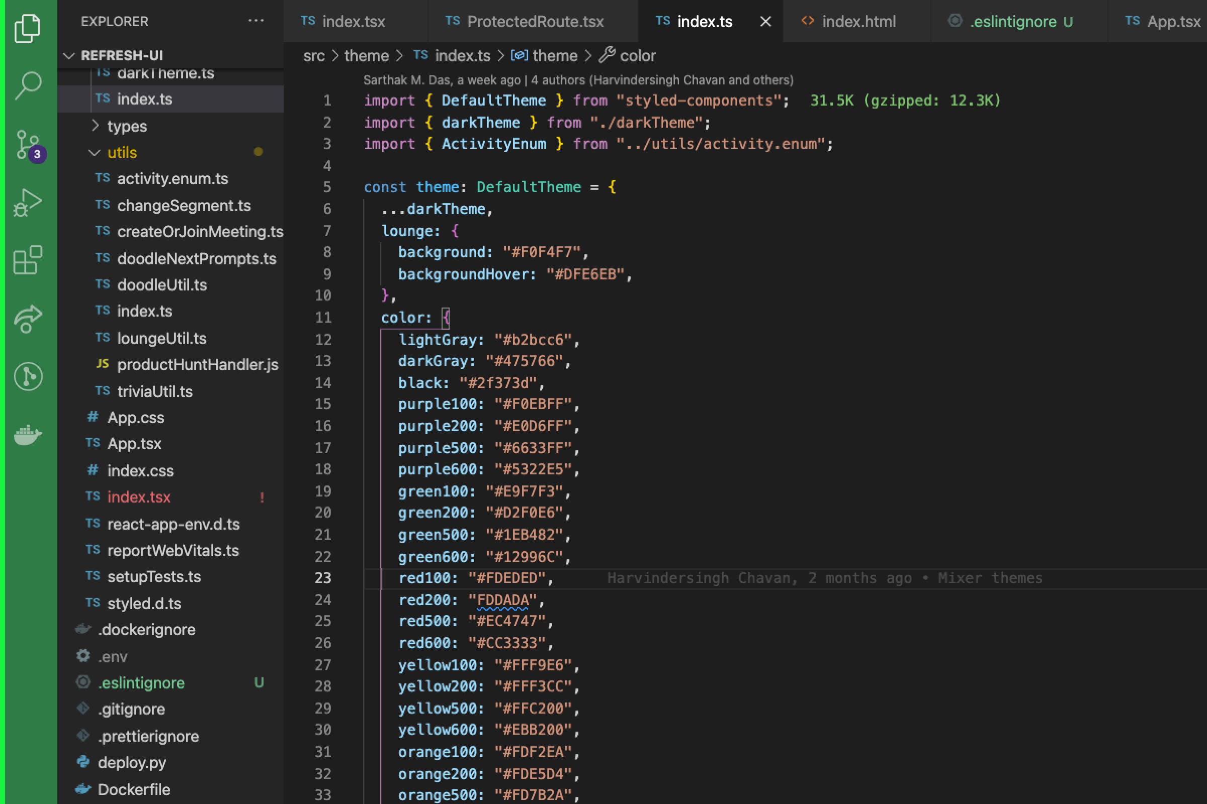
1. Start with colors
Color is one of the most important style guides, yet the simplest to implement. We started with 6 colors to be used in our product. All greys.

Next, we added our 6 brand colors and eventually variants of each of those for light backgrounds and hover states.

2. Text styles
Text styles are hard if you haven’t worked on type before, but if you look for examples online, map them out in your product, and start small you can build a minimum viable guide for the early stages.

Check out Apple HIG and Google Material guide for type scale inspiration.
3. Miscellaneous
Add the rest. Shadows. Strokes. Anything else you might need. and keep adding to it as you go.
Make sure you build it with your devs to map out the consistency. For example, our color styles are reflected in our code, when handing off, we don’t give hex codes, we give style name #purple500. If in the future we change our #purple500 it will not only be a click change in Figma across our files. It will be a code line change in the product itself.
With the peace of mind that you can anytime change styles later on in your product development stage, you can focus on ideas and not worry about visual details
Setup a Components file
You might not build a design system from the start, but you should start piecing together the recurring UI patterns and start placing them in a “Components” file.
These include, but are not limited to:
- Branding. social media banners, logo variants.
- Assets. Includes all the images, illustrations, etc.
- Shadows. All your shadow styles, with examples.
- Type. Text styles.
- Colors. With examples such as buttons and their hover states.
- Icons. A repository for all the icons you use.
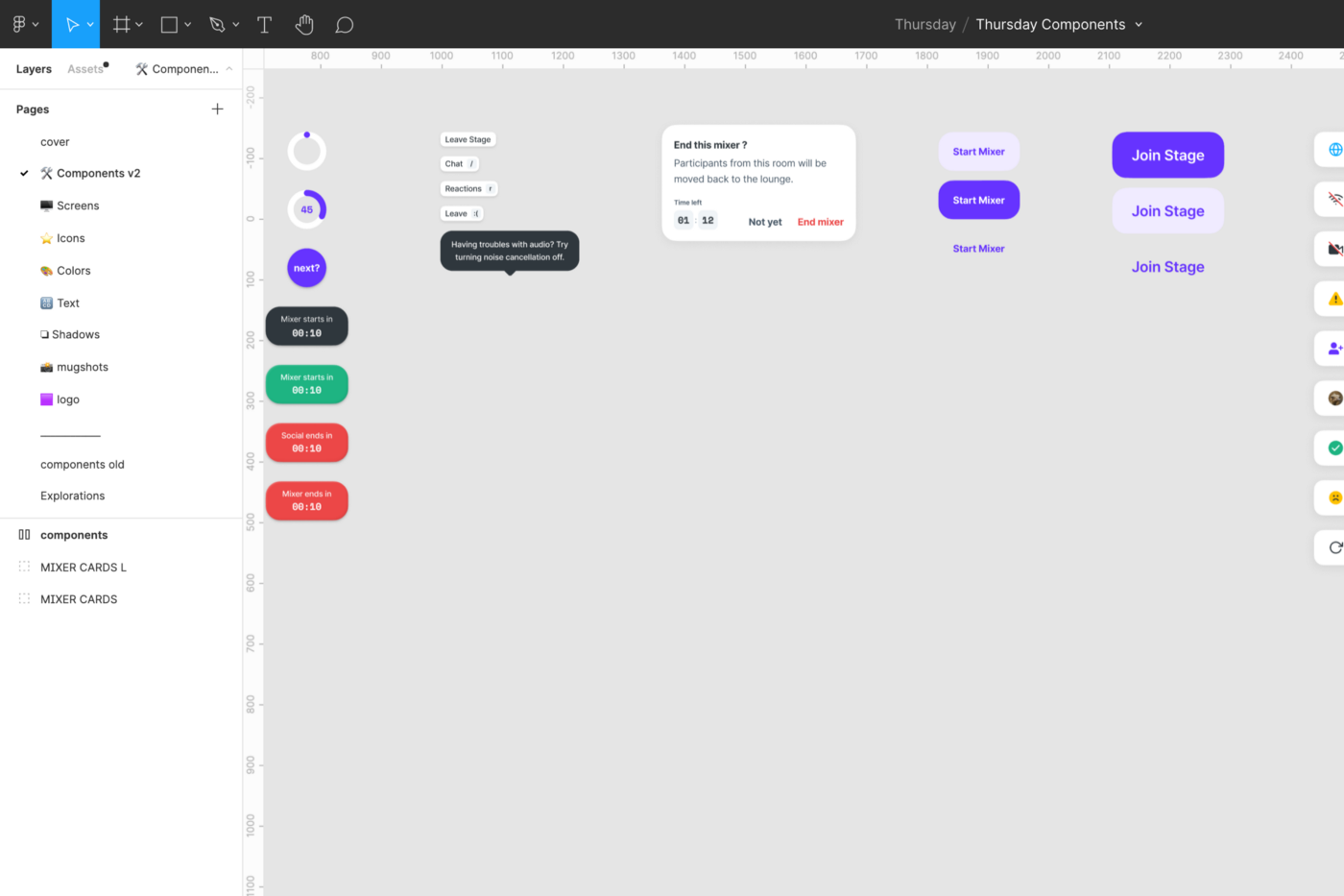
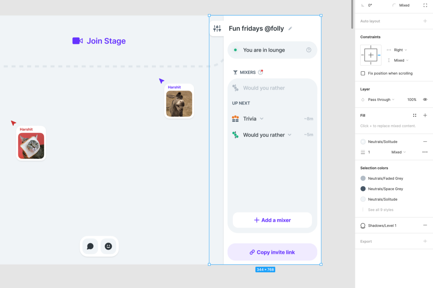
- Screens. Your main screens. Include home, settings, screens you will be using repeatedly. Apply your color, text, and shadow styles to these.
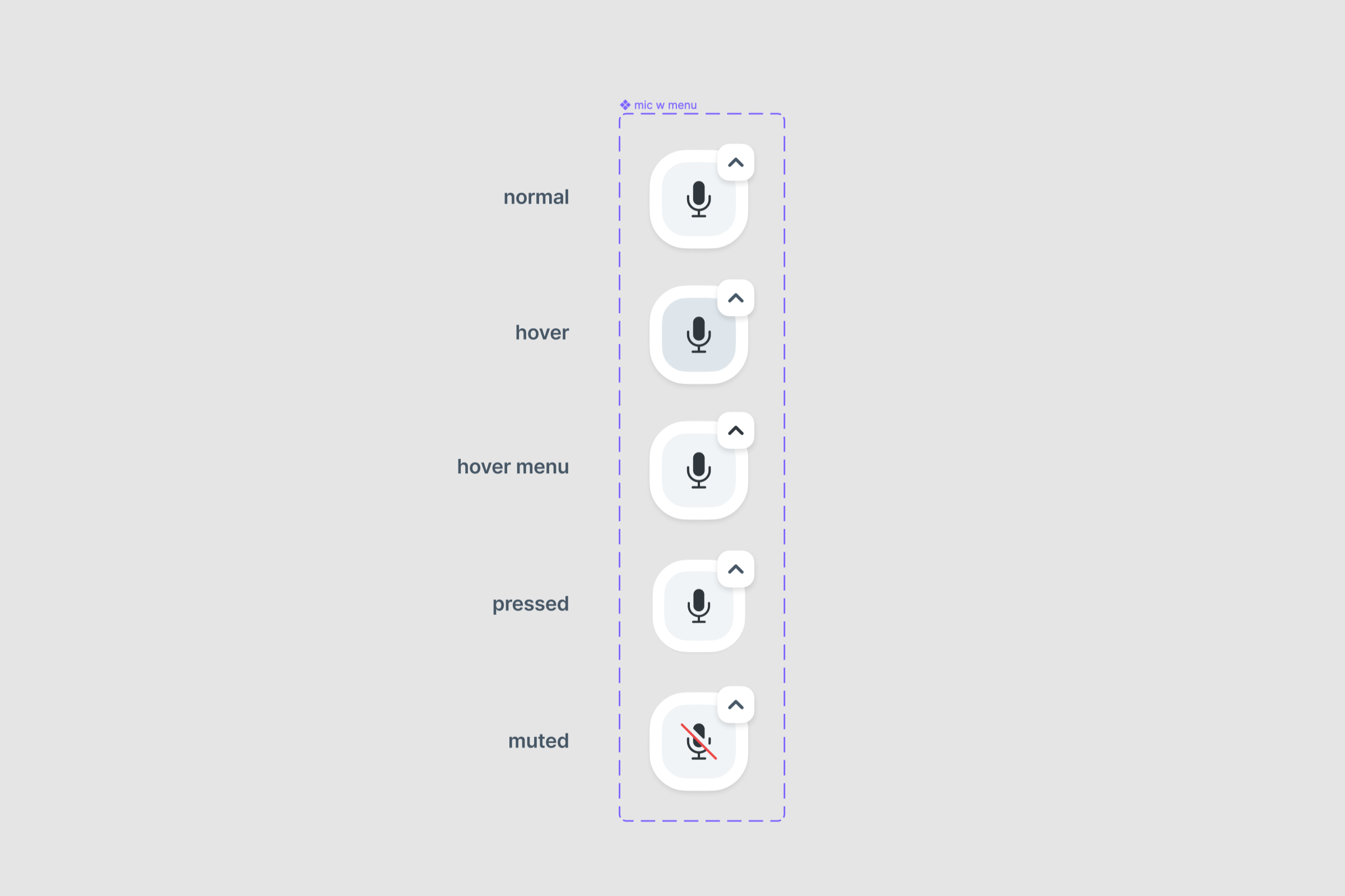
- Components. UI patterns you will eventually turn into Figma components once they start repeating enough times to make it worth your time.
This file is a playground for you to learn. For example, I tried out the Figma interactive components on our mute switch. Put them on our screens page. Now I don’t need to prototype the switch every time. Helps in times of a creative block. come here and play around with components, auto-layouts to make screen responsive, make variants and make them interactive!
More tips for Figma organization
Since you made it this far, some extras that helped us along the journey:
- Cover images. To help you move faster between Figma files

- Page names. Use specific names. For example, under our Lounge file, “Audio/Video settings” page is much easier to find after a few months than a vague “v2.1 explorations”
- Use 🟢 to mark handoff pages. Don’t overuse emojis.
- While handing-off, make sure styles have been applied.
Conclusion
You do not need to build a design system at this early stage, focus on the product and people. A style guide is enough for that, it maintains consistency and rolls the wheel to start building your design system as you go.
Using this methodology as a loose framework to guide our designs helped us build Thursday from 0 to 1 within 3 months, become the #2 Product of the day on Product Hunt and get immense feedback from our users.
Remember, “Real artists ship”.


